How Applying Universal Design Principles to Technology Can Transform Cities
By Branson Pierce, Chief Design Officer
In 1997, a team of designers, architects, researchers, and others laid out seven principles for what they called Universal Design. Their goal was to outline a way to make the spaces and structures we inhabit as useful as possible to as many people as possible.
The seven principles are:
- Equitable use
- Flexibility in use
- Simple and intuitive use
- Perceptible information
- Tolerance for error
- Low physical effort
- Size and space for approach and use
The idea behind these principles is that “good design” isn’t just a matter of aesthetics, it’s a matter of usability at scale.
While Universal Design principles were originally intended for physical spaces, they can be incredibly powerful when applied to digital environments. And when they’re put to use in govtech (i.e., the technology that helps the government-run), they can have a transformative effect on cities and towns.
Universal Design in Physical Spaces
First, let’s be clear about what Universal Design isn’t. It isn’t retrofitting a building so it has a ramp at the entrance. It isn’t updating door signs to have Braille beneath the lettering. Rather, it’s a comprehensive, from-the-start approach to building spaces that are both accessible and usable to as many people as possible.
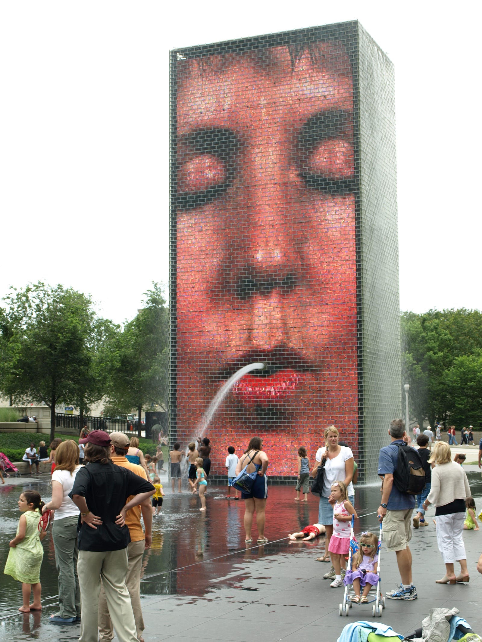
A lot of recently built spaces follow the principles of Universal Design, but one example I encounter fairly often is Chicago’s Millennium Park, built in the city’s downtown in the early 2000s. It includes a sculpture called Crown Fountain — it’s part art installment, part waterpark, and it includes no barriers higher than a quarter of an inch, making it usable for people with mobility aids like wheelchairs.

The reflecting pool part of Crown Fountain isn’t recessed like most reflecting pools — instead, it’s flush with the surrounding area, with just a small spillover area, making it easy to access whether you’re contending with a stroller, a wheelchair, or your own feet. And the fountain is just one feature in the park, which includes gentle ramps, accessible picnic tables and concert area seating, and tree grates that won’t snag canes.
But a tourist attraction is pretty different from the day-to-day demands most government technology grapples with. So let’s take a look at how Universal Design applies in the digital world.
Universal Design in Govtech: Front End + Back End
Local governments are increasingly bringing their information and services online, which is already making people’s lives easier. But current government websites often don’t follow the principles of Universal Design. For example, they may:
- Have small font sizes that are difficult to read, especially on mobile devices
- Lack of a consistent design, making it hard to find information quickly
- Have complex structures, with essential information only visible after several clicks
- Be written in dense or complex language that’s difficult to process for those with low literacy, learning disabilities, or primary languages other than English
- Redirect users to third-party sites for payment functions, requiring users to learn multiple interfaces
All this amounts to a problem: You have to know where to look to find something you need.
Perhaps even more frustrating? You have to know what you want to find — i.e., you need to understand how the government works well enough to know there’s something out there to benefit you — to look for it in the first place.
But even when governments update the front end of their websites so that they’re easy to use, they often leave the back end untouched. So you might have a beautiful page that shows you when your trash is getting picked up, when your taxes are due, and how to reach your alderman, but when you fill out a form to request another recycling bin, it’s still processed manually on the back end and takes days to resolve.
The ideal scenario is that govtech — and, primarily, in this case, a government’s digital city hall — ties together a usable front end with a highly functional backend to create a web experience that follows Universal Design principles.
Getting There: Proactive Cities
While it may seem like we’re a long way from the kind of experience I’m describing, the truth is that we’re closer than most people realize. It’s possible to make multiple back-end systems talk to each other in a common language so that instead of rebuilding from scratch, a city is able to adapt its IT as it evolves. This is the backbone of what we at CityBase call the Intelligent City.
Once a city’s agencies are communicating with each other, residents and city employees start to see major wins. Instead of having to enter your information over and over whenever you want to apply for a permit or a tax incentive, for example, you can sign up quickly because your information is a part of your secure profile.
After all, what’s more, usable than a system that works for you whether or not you know how to use it?


